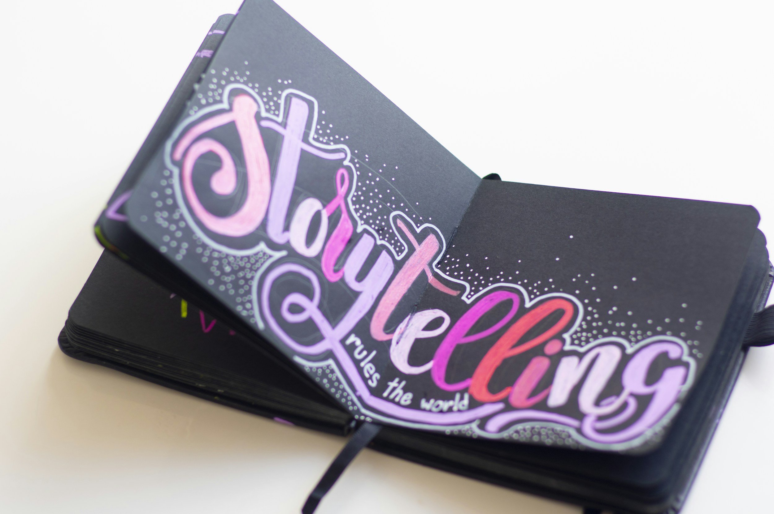
Data visualisation and storytelling
Each month our Nonprofit Datafolk Club workshops provide a virtual space for nonprofit people to get together and talk about data-related topics.
In February this year, we gathered to talk about data visualisation and storytelling.
Participants were asked a number of questions about these popular topics. Here is a summary of what they said:
How do you identify your audience for data storytelling, and what kind of prior knowledge would you assume they have?
Several people thought that assuming audiences had little to zero prior knowledge of the story being told or shown was the safest bet. Some participants stressed the importance of knowing your audience in advance, as they could be mixed and include people with ‘niche’ knowledge. One group suggested using ‘personas’ to provide tailored content.
Other participants thought that making assumptions could be problematic, especially if they were related to underlying values or basic knowledge. Producing lots of versions of the same story was also thought to be very resource-intensive.
What makes a good data story/visualisation?
Data storytelling was highlighted as needing a beginning, middle and end, with an emphasis on scene-setting, case studies, and bringing different pieces of the puzzle together, to help answer the ‘so what’ question.
Participants also noted the importance of accessibility and ensuring visualisations work well with screen readers.
Another central thread in the conversation was related to how to communicate effectively to get buy-in, with one participant saying that people compiling data – rather than comms teams – should do the communicating. One suggestion involved adopting sales tactics to ‘start with the emotion’, ‘back it up with the facts’, and ‘finish with urgency’.
People talked about infographics, using different formats like video, and keeping things simple, punchy and engaging, with a clear message that captures the imagination and sparks curiosity. There was also an emphasis on balancing complexity and caveats alongside different levels of depth to appeal to different audiences. Making good use of colour and ensuring a logical flow to the message being conveyed were mentioned as important.
One participant said that what sticks most in storytelling and visualisation tends to be a clever yet simple way of articulating a powerful story. Others mentioned leaving room for further exploration and discussion, while removing the potential for people to leave with different takeaways.
Finally, people remarked that “people love maps”, and “a picture paints a thousand words”.
Brilliant examples of data-driven stories
Participants were then asked to share some examples of brilliant data-driven stories, and to talk about particular visual cues or storytelling hooks that worked for them.
Examples shared included a visual data journalism story, an interactive map, business intelligence platforms, data-driven mythbusting, and an infographic of Napoleon's warfare attrition.
Participants also shared some examples and go-to places for inspiration:
Participants’ list of datavisualition links
Common Mythconceptions - World's most contagious falsehoods - on Information is Beautiful
The crimes behind the seafood you eat - by Ian Urbina for the New Yorker
The Lincolnshire Visual Intelligence System
Join the Nonprofit Datafolk Club
If you found this resource interesting, or if you have any curiosity in nonprofit data more generally, please come and join us at our next workshop. Each month has a different topic, and you will be able to find the details on our events page. Previous topics have included: